Or ready to use framework.
Content
Content of this styleguide is divided into four main categories: introduction, foundation, components and javascripts.
Note
Navigation between these categories is on left side of page (hamburger menu for small screens).
Components
Components are separate sub pages that contain documentation for groups of similar components. Each component can contain sections and each section can contain subsection. List of sections can be found under main info (or in right sidebar for large screens).
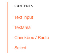
Preview of sections list.
Documentation
In addition to text in documentation, there are few components as example, note, warning or dependency for better explanation and illustration of styleguide components.
Note
Note is component used for additional informations or documentation.
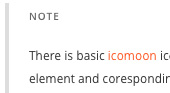
Preview of note.
Warning
Warning is component used for showing importent informations or documentation.
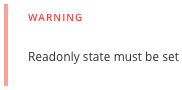
Preview of warning.
Dependency
Dependency component is used in case that component require additional files or tools.
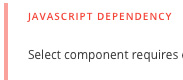
Preview of dependency.
Example container
Example container serves to illustrate visual form or functionality of documented components including sample code. To show/hide sample code just click on code icon at top right corner.
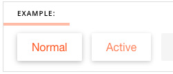
Preview of example container.
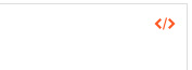
Preview of toggle code.
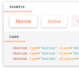
Preview of example with code.